If designed with love and attention to detail, a logo can say a lot more about a company than any website or booklet. Although any emblem will inevitably change with the brand, it must stay true to the company’s values and ideas. In this article, we’ve collected logo samples of renowned companies and followed their evolution throughout the years. While the authors of some logos remain nameless, other artwork has been created by entire teams of designers and other specialists. Because some companies have had many logo variations throughout their histories, we selected the most noteworthy examples for this article. We hope you enjoy this visual journey just as much as we did!
1. Google
Millions of users see the Google logo on their computer and smartphone screens on a daily basis. This colorful emblem is a globally recognized symbol for the major search engine that receives more than 100 billion visits per month. A company like Google simply cannot have an uninspiring icon. Known for its flawless sense of humor, Google has created an appropriate logo to emphasize this quality!
2. IBM
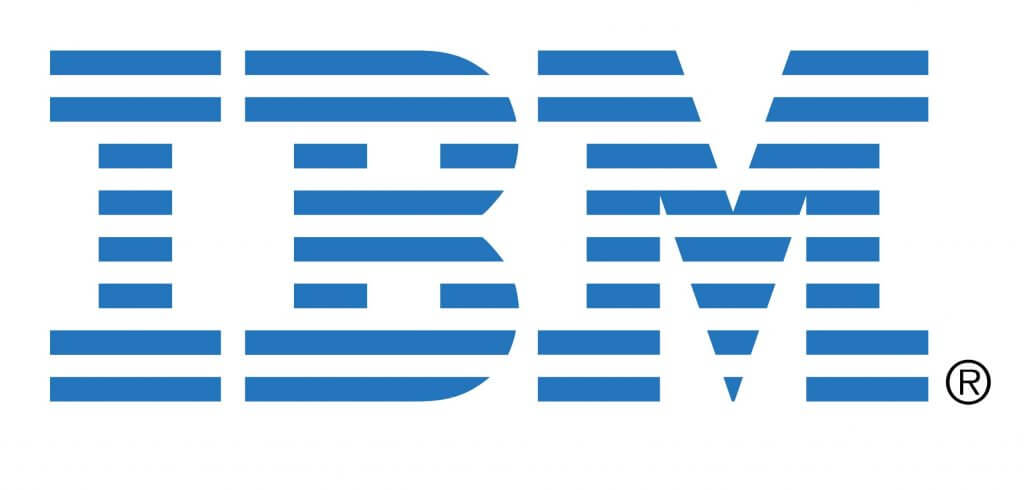
Created by the famous graphic designer Paul Rand, the striped IBM logo replaced the old company symbol of a black and bulky IBM abbreviation. Such a drastic change in brand identity was not a random move; it symbolized a major switch in corporate priorities, with the stripes standing for speed and flexibility.
3. Walmart
The retail giant Walmart proudly tops Fortune 500, the list of the world’s 500 largest companies. Last year, the retailer’s profits hit the jaw-dropping $450 billion mark. In 2008, the company’s corporate identity underwent a complete overhaul. The logo became more saturated with color and said good-bye to the star between the words “Wal” and “Mart.” Nowadays, the logo looks classy in light blue shades, with a yellow spark making it more friendly and open.
4. Visa
The new Visa slogan “Everywhere You Want To Be” is the best way to describe the company’s ubiquitous logo. We can see it on TV, restaurant doors, and, mainly, the plastic cards we carry around all the time. The new visual image made its debut in 2006, replacing its blue and yellow rectangular predecessor.
5. eBay
The established online auction introduced its brand-new emblem in 2012. The previous logo came into use in September 1997, when the company changed its name from Auction Web to the eBay we all know. To convey the brand’s energy and dynamism, the new logo uses zigzag letters and a bold color palette. By slightly overlapping the letters, the company emphasizes the deep sense of community for which its loyal advocates are known.
6. FedEx
The FedEx logo is a fine example of hidden advertising that never fails to affect customers on an unconscious level. Take a closer look at the white space between the big “E” and the small “x.” Can you see an arrow? The postal services provider uses this trick to say that your parcel will arrive on your doorstep sooner than you can blink! Furthermore, FedEx recognizes a smart color palette when it sees one. The letters “Fed” always stay violet, while the “Ex” part changes in color depending on the company’s service. Grey is used for the corporation as a whole. Orange stands for FedEx Express, while red defines FedEx Freight. Blue, yellow, and green identify FedEx Kinkos, FedEx Trade Networks, and FedEx Ground, respectively.
7. 3M

Two bulky red symbols. Can a logo get any simpler than that? Although this emblem looks like it was created in 15 seconds, it would be a big mistake to think so. The artwork drew everyone’s attention back in 1978, when it was first presented to the public. The original logo was a round stamp with the company name (Minnesota Mining and Mfg. Co.) and address placed around its edge. The center of the logo featured a diamond shape with the “3 M Co.” inscription. Since 1906, the logo has lived through multiple rebrandings, shedding its intricate elements along the way.
Consistency in logo design
Some logos never change, which is a good thing. If customers love and value a company, it doesn’t need to rebrand. Check out some powerful brands that haven’t changed their emblems for years and are totally fine with it!
8. Coca-Cola
With a net worth of $31 billion, Coca-Cola is one of the largest and richest companies on the international scene. In terms of popularity, the Coca-Cola logo can compete with the US’s official symbol, the bald eagle. It’s hard to believe but Coca-Cola has been using the same corporate font (Spencerian) since 1887! With such a consistent approach to its brand identity, Coca-Cola has shown the importance of creating and respecting one’s corporate traditions.
9. Nike
The Complex magazine named the famous Nike swoosh the most recognizable logo of all time. For many years, this simple geometric shape has been synonymous with high-quality apparel and shoes for active people who enjoy taking care of their health. The emblem was designed by Caroline Davis, a student of Nike founder Phil Knight. After paying the ridiculously low price of $35 for the artwork, Knight had the following to say about the new logo: “I don’t like it but I’ll get used to it.” This is one incredible story, right?
10. Olympics
For 200 years, countries all over the globe have shown their love for sports and competitive spirit by sending their best athletes to the Olympics. This is the time when nations forget their disagreements and come together to celebrate the unifying power of sports. Since 1912, the Olympic movement has used five overlapping circles that represent the five parts of the world (America, Asia, Africa, Europe, and Australia). Plus, the circles’ colors (red, blue, yellow, green, and black) can be seen on the national flags of all countries participating in the Olympics.
11. Disney
Walt Disney isn’t just an animation studio but a huge conglomerate that owns ABC, ESPN, Pixar, Marvel, History Channel, and – its most recent addition – Lucasfilm. On the company logo, you can see the real handwriting of the legendary Walt Disney. For millions of children around the world, this image is synonymous with magic and fun. Stylish and simple, the logo precedes all Disney films and cartoons and embellishes toys, mugs, sweaters, and other promotional products.
12. UPS
Did you know that United Parcel Service of America recently celebrated its 100th anniversary? And this is just the beginning for the postal service that delivers 15 million parcels to people in 220 countries every day. Over the course of its long history, the company has had four logos, three of which featured the UPS abbreviation inside a shield. The first emblem was introduced in 1937. The latest logo was born during a global UPS rebranding effort in 2003.
13. GAP
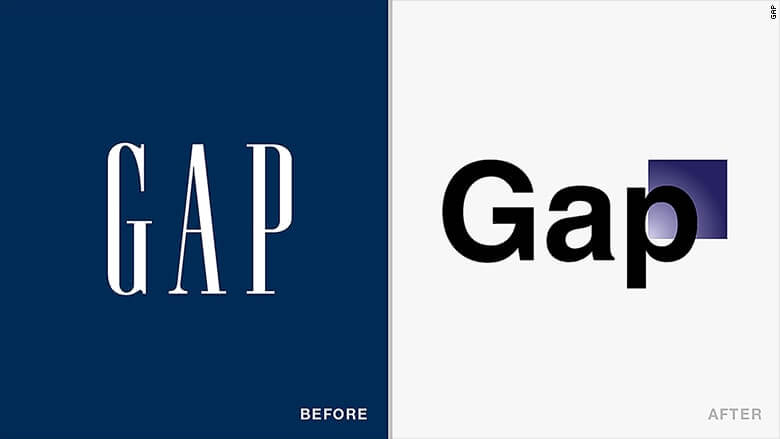
Founded in 1969 by Donald and Doris Fisher, GAP is a clothing company loved by millions of people in the US and worldwide. The original emblem was all about minimalism, with the word “gap” written in a plain font on a white background. In 1984, the apparel brand decided to spice up its corporate personality. This was how the iconic navy blue square was born. As a part of its 2010 rebranding campaign, the company decided to make its visual image more modern and sensual. However, loyal fans of the brand booed the decision. Faced with the negative reaction, GAP had no choice but to return to its old emblem.
14. WWF
World Wildlife Fund is a non-profit organization that aims to restore and increase the population of endangered species and protect their natural habitats from global threats, such as poaching and climate change. From its foundation in 1961, the Fund has stuck with an adorable panda as its symbol. Of course, the logo has been slightly changed over the years but has managed to stay true to its nature (no pun intended).
Simplicity in logo design
Successfully applied in many industries, the famous approach “less in more” plays a crucial role in marketing. Sometimes it’s a good choice to avoid excess embellishments and explore the benefits of minimalist design. We’ve collected a few corporate images that speak volumes without being distracting.
15. Apple
It’s safe to say that Apple is a trailblazer that has paved the way for multiple IT companies. Known for its innovative consumer electronic products, Apple enjoys the support of an army of loyal fans. Its globally identifiable logo was created in 1976 by Steve Jobs himself. Just like any other corporate image, the emblem has tried on different visual styles, including a shining effect and gradients. Currently, it features a light grey apple silhouette against a white background. Simple yet powerful!
16. McDonalds
Two golden arches in the form of the letter “M” have become synonymous with juicy hamburgers, fries, and other delicious food. This symbol is hard to miss, even on a busy highway among dozens of other signs and billboards. More than 60 million people visit McDonald’s restaurants every day! The fast food company is truly iconic, in part thanks to its amazing emblem. Since 1940, the company has undergone several rebrandings, ultimately reducing its logo to a yellow “M” in 2003. That was one hell of a wise move! According to Business Insider, the Golden Arches have become more recognizable than the Christian cross!
17. Pepsi
It’s hard to find a more balanced color combination than red, white, and blue. Seems like these shades were made to be together. As it turns out, Pepsi knew that all along and used this color scheme in its concise, minimalist logo. With wavy lines inside a small circle, the emblem looks relevant and fresh, adding a new quality to the established brand.
18. Target
Target is one of many brands that chose to transform its already simple logo into an even more streamlined image. In 2007, the retailer figured that its emblem had become popular enough to part with the company name and continue the journey on its own.
19. Microsoft
Microsoft is another company that has drawn inspiration from the “less is more” concept. The result of a 2012 rebranding, the new emblem consists of four colored squares that form a bigger square. Used in Microsoft software products since 1992, this edgy image only recently became the brand’s official logo.
20. Shell

Gasoline isn‘t a cheap product. Despite its pricey rates, the oil giant Shell tops the list of companies with the highest annual revenues (Global 500). Starting in 1990, the company has used a shell as its corporate symbol. With each consecutive redesign, the logo became increasingly less reminiscent of its natural prototype. The company developed its iconic red and yellow emblem in 1948. In 1999, the brand name was removedfrom the logo.
21. Starbucks
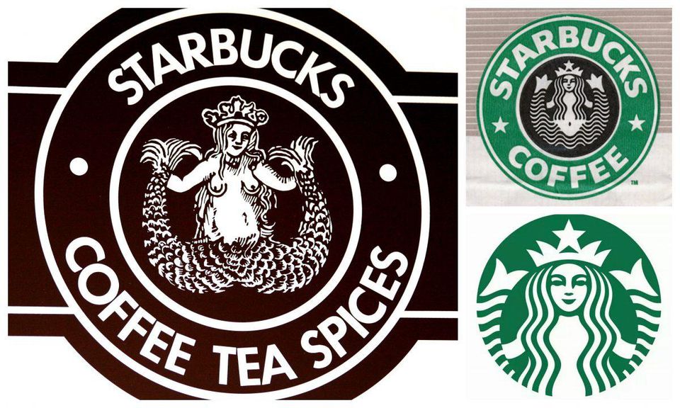
Starbucks is another brand that decided to get rid of its name (Starbucks Coffee) in 2011, switching from a combination mark to a pure logomark. Furthermore, the background behind the smiling seamaid was changed from the reserved black to the friendly green. It took Starbucks 20 years to arrive at a straightforward, easy-to-perceive corporate image. Kudos to the iconic coffeehouse chain!
22. Canon
The very first logo of Seiki Kogaku Kenyudho, a Japanese manufacturer of consumer imaging products, featured the Buddhist goddess of mercy, Kwanon. Over time, the company decided to shed the image of the goddess, leaving only her name “Kwanon.” Following its mind-blowing success in 1935, the company changed its name to a more relatable “Canon” and overhauled its emblem. In 1956, Canon introduced its logo as we know it today.
23. Intel
Designed by Robert Noyce and Gordon Moore in 1968, the original logo for Intel had a curious peculiarity, with the letter “e” shifted slightly down. Compared to its predecessor, the modern logo is a little more sophisticated. The brand name is now located inside an ellipsis and reinforced with the “Leap Ahead” slogan.
As a bonus, you can check out the history of the Bitcoin logo here.
We bet you’re pumped up with inspiration and are ready to create your own artwork! Try out the ZenBusiness online logo maker to design your own brand logo design in no time!
Popular Brand Logos


