- What makes a modern logo?
- Modern logos of established companies
- How to create a modern logo quickly and easily
Design – in particular logo design – is one of the most dynamic and fastest-changing industries. A logo will serve as your company’s identification for years to come. That is why it’s so important to create a modern logo that will reflect the latest trends in the industry. Logo design trends are often criticized for being fleeting. However, this is not entirely true. While some trends disappear literally overnight, others shape the industry for several years. To survive the harsh competition, your emblem must be both original and relevant.
Whether you’re creating a logo by yourself or with the help of a professional designer, it might be a good idea to incorporate one or two of the latest trends into your corporate design. This post will review the top trends that have defined the logo design industry in 2018. In addition, it provides some amazing logos from which readers can draw inspiration. We hope that these trends will shape the next year as well. Be sure to use this information to fuel your imagination and find the right concept for your brand identity.
What makes a modern logo?
Most successful logos share a number of characteristics that classify them as “modern.” After analyzing hundreds of modern emblems, we’ve found what they have in common.
Easy-to-understand symbols
The modern environment encourages designers to shift from abstract and sometimes ambiguous forms to straightforward visuals. A visual element must be simple and to the point. It must “speak” the same language as the audience, bringing the brand closer to its potential customers. Nowadays, the international market is open to businesses of all types and sizes. As the competition grows, companies come up with globally recognizable symbols. This is the only way to appeal to audiences across different countries.
Original patterns
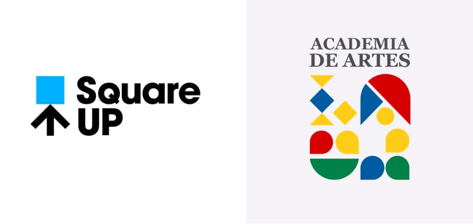
Whether used on a colored background or as standalone elements, original patterns have become an organic part of modern logo design. These elements play a trick on the audience, making them take a closer look at the details and, consequently, memorize a logo without even realizing that they’re doing it.
Simplicity

We should have opened our list with this trend because simplicity is widely considered to be the most important characteristic of modern logos. It ensures that an emblem remains legible on any carrier, whether digital or not. Signs, billboards, magazine ads, online shops…a richly decorated logo would never pull off such a variety of contexts! Realizing this, plenty of brands have gone back to the basics, stripping their emblems of excess colors and details. A minimalist logo immediately gains a new quality.
Experimentation with letters and words
Because most modern emblems are logotypes, experimenting with letters has become a favorite pastime of logo designers. Oh, the things you can do with letters! You can stack letters into a column, write them in different fonts, combine them with different graphic elements, and much more. Tireless designers are inventing new ways to make a logo catchy and striking. You’ve probably seen letters cut in half with a straight line or cropped out. Think about the amount of hard work and creativity involved in crafting such a logo!

Lettering

Among logo design trends, lettering is a respectable old-timer. Although it reached its peak in popularity a few years ago, this worthy trend is still full of life. Design studios, photographers, barber shops, and other businesses opt for handwritten emblems that attract audiences with their originality and charisma. At the same time, lettering is one of the hardest logos to create. Why? Because creating a lettering logo – one that is both unusual and easy to read – takes a lot of skill.
Vintage
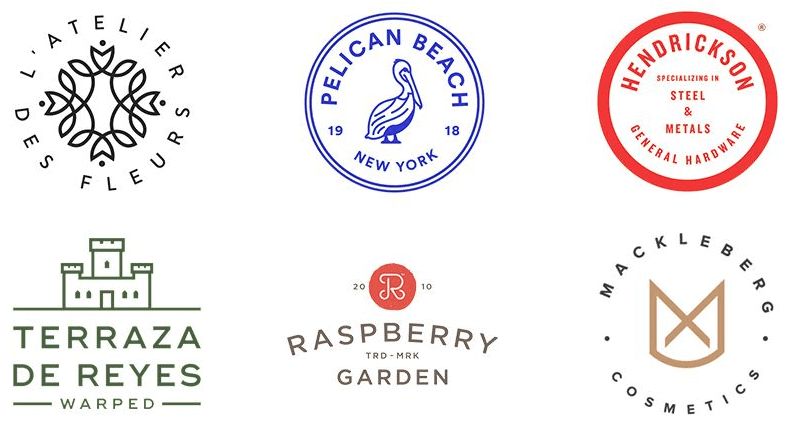
Aptly designed vintage logos are still in demand in 2018. The past has always been a popular theme in design. People often get nostalgic when looking at old furniture, watching old movies, or thinking about old times. Many designers use this to their advantage. A vintage emblem can give your brand an “old-school” feel. This is a good thing because customers tend to trust authoritative businesses with lots of expertise. If you want to emphasize your conservative values and rich traditions, you should explore the vintage trend. If, however, your company is involved in innovations and advanced technologies, the vintage theme will look out of place.
Geometric shapes

Minimalist text and geometry create a classic, time-tested combination. We bet you can remember a few logos that prove this statement. The abundance of geometric shapes allows any designer to craft an exciting emblem that won’t give competitors a chance. Geometric forms can create an abstract image that the audience can easily read and interpret. Plus, vivid geometric shapes will be a great addition to boring text, acting as attention triggers. Add one or two vibrant colors, and there you have it: the logo of your dreams!
Color overlapping

The simplification trend has affected not only geometry but also colors. Nowadays, designers prefer to use fewer shades. Most modern logos feature 2-3 colors. In recent years, this trend has evolved hand in hand with color overlapping. As you’ve probably guessed from its name, color overlapping is when one color is placed over another. The rebranded Mastercard logo is probably the most successful example of this beautiful technique and provides further proof that a refurbished logo can breathe new life into a brand.
Realistic textures
We’re wrapping up our list with another effective yet rare technique. The powerful thing about elaborate textures is that they make your logo look crisp and realistic. Such an emblem is sure to stand out among less exciting competitors and gain appreciation from an audience. The reverse side of the coin is that an overly detailed texture loses its visual power when the logo is scaled down. This makes your logo inappropriate for a number of platforms and carriers. While this is a major deal breaker for many companies, it’s up to you to decide whether you can sacrifice practicality for visual beauty.
Modern logos of established companies

Trendy logos are popular among both aspiring startups and big-name companies with established reputations. Keeping track of the latest logo design trends is a good way to show your customers that you care about your brand identity. By incorporating advanced techniques into your corporate emblem, you make it more appealing to the audience. We’ve put together a nice collection of breathtaking modern logos used by global companies across the world. Enjoy!
How to create a modern logo quickly and easily
We invite you to take a look at the modern logos that our users have created on the ZenBusiness website. These emblems are successfully being used by real-life businesses with different priorities, goals, and product ranges.
The ZenBusiness logo maker can satisfy any company’s needs. It offers a wide range of functionalities for designing a stunning modern logo, using any technique that this article describes. In just minutes, you’ll get a fresh, original corporate design that will define your brand’s success!

