Do you know how to avoid mistakes when creating a logo? Make sure that the design is in harmony with the content: convey the main message and make the logo technically flawless. We have created a complete quality control guide. We will cover the main criteria of an unsuccessful logo, share the worst and the best examples, and advise on what you should pay special attention to.
Seven criteria of a bad logo
It doesn’t matter what idea you want to convey with a brand identity, if it was made in terrible quality. Check if your logo has one of these signs.
1. Raster format
Files made in raster graphics cannot be enlarged without quality loss. You’ve probably noticed this effect on photos taken on a phone. When maximized, the image looks blurry. The same thing happens when you scale a logo in a raster format (PNG, JPG, JPEG).

How to avoid it? A standard logo is made in two versions. Vector graphics (AI, EPS, SVG, PDF) allows you to easily enlarge a small image to print it on a banner or billboard. Raster files are suitable for low-resolution usage, for example, on a website or social networks.
2. Incorrect display on different media
A logo is often seen as a separate image out of context. However, your logo should work harmoniously on any product and electronic media: from business cards and pens to mobile applications and presentations. When scaling, a high-quality and thoughtful image remains legible and brings the same meaning.
How to avoid it? Avoid over-detailing as it will make the image illegible when scaled down. Prepare different layout options: in horizontal and vertical orientation, standard, and simplified. Check how the image looks on paper and digitally.
3. Lack of uniqueness
Do you sell cars and choose a car as a symbol? Your competitors probably did the same. Design cliché is not the best solution to demonstrate brand uniqueness.
How to avoid it? Pick an original character that will set you apart from the competition. Stay away from hackneyed associations: travel agency and a globe, jurisprudence and Themis. But do not go to extremes by choosing a character that’s opposite to who you are – just try to expand on the associative characters.
To make sure that your logo is unique, use Google search engine. Go to Google images and click on the camera icon (“Search by image”) in the search bar. Upload your logo file from your computer and the service will display images that match yours or similar to it.


4. Color disharmony
A mixture of many colors, cloudy shades and inharmonious combinations is a bad choice when creating a logo.
How to avoid it? Designers recommend using no more than three colors. Work with a color wheel (for example, on Adobe’s website) which will offer several combinations for you. Do not forget about color psychology compatibility with the brand’s palette.

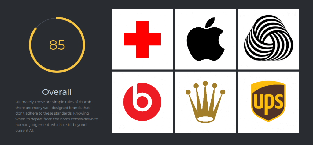
Another way is to use the service provided by Brandmark.io, which allows you to quickly find out the quality of the finished logo. The artificial intelligence system compares your image with more than a million well-known logos. Simply upload the picture to the site and the service will check it according to the criteria of uniqueness, intelligibility and color harmony, and then give useful tips and ideas on improvement.


5. Poor black and white version
The logo should look equally good both in color and in black and white when printing on standard forms and other documents. Remember: if you use too many shades or a gradient, the logo will not be versatile.
How to avoid it? Once the design is done, do not forget to make the image black and white and check if there are any problems with the color. If the image does not have enough contrast, then in the monochrome version the texture will merge with the background, and logo elements can become indistinguishable. In this case, it’s worth increasing the contrast of the picture.

6. Illegible font
If people do not understand what is written on your logo, they are unlikely to be interested in the brand. Illegible typography and mixing different fonts look messy.

How to avoid it? Do not select hard-to-read fonts, check their legibility in small size. Do not use more than two styles and remember that typography conveys the character of the brand. For example, a handwritten font is associated with creativity, serifs are associated with luxury, and simple clean lines look modern and democratic.

7. Lack of kerning
Kerning is a manual adjustment of the distance between letters so that they look harmonious and readable. All the intervals are the same in ready-made fonts. However, due to the unique shape of each letter, sometimes they may appear to be too close or far apart from each other.
How to avoid it? Manually adjust the font so that the distance between the characters are the same visually.

Three examples of bad logos
Mistakes in branding are made even by large companies. Here’s a selection of bad logos to help you learn from their examples.
PS5

The new PlayStation 5 identity, introduced in early 2020, caused a lot of discussions not because of its originality, but because of its striking similarity with the previous version. This is the same monogram from the letters “P” and “S” located in different planes, and the abbreviation PS5.
Widely announcing a new product and branding, Sony ended up in an awkward situation and was criticized for being afraid of taking risks. This caused a flurry of ridicule among designers and users.
Tip. Safe choices are not suitable for a brand that wants to grow. If you decide to redesign it, demonstrate the growth and changes in the company with it.
GAP

The company held one of the most scandalous rebrandings in history. In 2010, GAP made a fatal mistake: it suddenly changed its identity, deciding to become more modern. Fans were horrified when the stylish white lettering on a dark blue background was replaced with bold black sans-serif letters. The blue square was reduced and moved to the upper right corner, where it began to resemble a blurry spot.
Designers called the new design cheap, banal, and ridiculous. Fans of the clothing brand wrote angry messages on social networks. A week later, the company was forced to change it back to the old logo.
Tip. Before rebranding, make sure that it is really necessary. Rely not only on your assumptions, but also on the opinions of users.
The United Arab Emirates

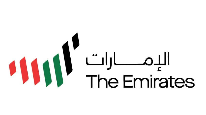
In 2020, the United Arab Emirates presented their logo. 49 people worked on its design with seven specialists from each emirate. Several ready-made options were put to a vote on social networks.
Users chose an intricate image with seven parallel lines in the colors of the national flag symbolizing the number of emirates, and the shape resembles the map of the UAE. The name of the country is written in two languages next to it. Designers believe that the logo was not very successful as it does not reflect the individuality of the country:
- the shape of the UAE map is not as recognizable in the world as, for example, Italy, so the idea is difficult to convey
- sharp graphics are neither associated with sea waves, nor with Arabic calligraphy or sand dunes
- the typography looks faceless
- the overall composition is very complex and hardly scalable
Tip. More careful thoughts do not necessarily mean better. Scrupulous process has led to the fact that the logo is overly detailed, boring and does not carry an emotional charge. It lacks the quality that a powerful cultural and historical symbol should have and therefore doesn’t emit warmth.
Two examples of successful rebranding
How to make your logo better? Get inspired by the techniques that successful brands use. We have selected two excellent examples for you.
Hyperloop TT

Elon Musk’s company Hyperloop TT (“Transport Technologies”) is building the so-called hyperloop: pipe systems through which vehicles can move at super speeds. This is the idea that its new identity conveys.
The logo remains textual, but the font was changed. Instead of futuristic letters with torn lines, the typography has become very smooth to create the association of movement along the pipes. This visual flow is complemented by the combination of the letters “TT”: their horizontal lines are torn off from vertical ones, as if they are moving quickly inside the tunnel.
Another feature of the new emblem is the dynamic version, in which the two “TTs” turn into the first letter of the name “H”. Both full and simplified versions convey the same message, recalling the rail system through which trains all over the world rush.
Petbarn

An Australian pet-related retailer has transformed the brand into a living organism through its identity. Although the spelling of the name has not changed, the static icons of the animals’ faces have been replaced by animated cats and dogs.
“Petbarn understands the importance of our relationship with our pets, their personality, and quirks,” the company explained. “We have created a personality that heroizes our pets, turning them into the basis of the brand.”
Each of the revived pets has its own cute features that emotionally attach the target audience to the company. The new identity tells customers that the brand does not just make money from their pets, but loves and cares about them.
Another great logo transformation you can check is the history of the Bitcoin logo.
Conclusion
Let’s summarize the basic steps that are needed in order not to make mistakes when choosing a logo:
- Familiarize yourself with examples of both good and unsuccessful logos, analyze what tricks were used.
- Think over the main idea of the symbol. It should evoke emotions and convey the character of the brand.
- Start visualizing. If you are not confident in your skills, use online logo generators.
- Check the finished logo according to the seven basic quality criteria.
- Test your brand identity on focus groups and start tweaking.


