Who hasn’t seen the colorful logo that represents the Firefox browser! However, few people know that the company’s journey towards its emblem was not an easy one. From this post, you’ll learn how Firefox managed to overcome copyright troubles and why it hasn’t changed its emblem for years.
- Backstory behind the Mozilla emblem
- Logo evolution
- How would Mozilla logo look like if it were made in ZenBusiness?
Backstory behind the Mozilla emblem
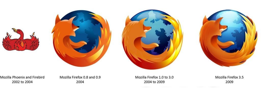
In 2002, when the company first entered the market, its name was not “Mozilla Firefox” but “Phoenix”. Its logo displayed a powerful fire bird resurrecting from the ashes. However, it turned out that the name was already occupied. The brand took on the name of “Firebird” but that option was not free either. Ugh, seems like a streak of bad luck!
In 2004, the brand came with the option “Mozilla Firefox”. It was the third — and finally successful — attempt to name the aspiring digital startup. Here is a curious fact. While many users think that the emblem displays a “fire fox”, it’s not the case. The animal on the logo is the red panda, a rare and protected species that are only found in Asia.

On the Mozilla logo, the panda is embracing the blue globe. The meaning behind this design choice is that the browser works fast and is accessible to users worldwide. The bold combination of saturated colors add energy and dynamics to the art piece.
Logo evolution
It seems like those several unsuccessful attempts made Firefox really appreciate its logo. That would explain why the brand had been remarkably loyal to its visual symbol for many years. Over the years, the emblem only saw slight changes in its color palette and detalization. In 2019, the company took the courage to do a complete redesign, creating a new brand identity for its products.
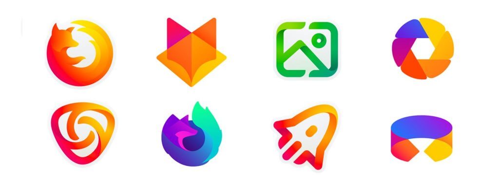
Along with a revamped company logo, the new corporate style included a collection of icons for representing different products. Designed in orange and violet shades, the new logo stands out through its smart use of gradients and original geometry. As for the browser logo, it remained mostly unchanged. Still, Mozilla decided to replace blue with violet and get rid of some of the graphic elements.

How would Mozilla logo look like if it were made in ZenBusiness?

Conclusion
Here comes a very important lesson for businesses that are just starting out. When working on a name and logo for your brand, make sure you’re not infringing on another company’s copyrights. Your negligence may become a major obstacle on your way to success.


