Contents:
1.Emotional associations
2.How to pick the right color scheme?
3.How to match colors?
4.Three types of colors
5.Use the color wheel
6.Choose the best color scheme
For nearly 85% of customers, color is the key motive behind a purchase. As an entrepreneur, you need to leverage the power of colors to drive users to your blog, online store, or landing page. In this article, we’ll reveal why you need to study the psychology of colors, how color perception depends on age and gender, and how to combine main, background, and accentuate hues.
Emotional associations
The human brain transforms colors into emotions. This makes color the quickest way to create the first impression and evoke specific associations. Corporate shades have the power to boost brand recognition – and therefore customer loyalty – by a whopping 80%!
What hue comes to your mind when you’re thinking about Coca Cola? It’s for a good reason that the multinational giant picked red as its flagship color. Red is a globally recognized symbol for love and joy. Used by 29% of global brands, red is among top popular shades in the business world. The first place belongs to blue (33%), while the third place goes to black and grey (28%). Take a look at the connotations behind the basic colors.
Warm colors:
- Red — Dynamics, emotions, passion, power, love, joy (McDonald’s, CNN, Netflix, Pinterest, H&M);
- Pink — Sweetness, romance, warmth, compassion (Barbie, LG, Victoria`s Secret);
- Orange — Success, determination, friendliness, delight (Amazon, Firefox, Fanta);
- Yellow — Youth, freshness, optimism (DHL, Shell, IKEA, Nikon).

Cold colors:
- Green — Serenity, relaxation, trust, peace, hope (Animal Planet, Starbucks, Android);
- Blue — Comfort, reliability, honesty, loyalty, integrity (Samsung, Skype, Ford, Facebook);
- Violet — Glamour, strength, will, ambitions (Hallmark, Yahoo, Cadbury).

Achromatic colors:
- White, black, and grey — Elegance, style, luxury, modernity, wisdom (Nike, Apple, Chanel, Puma, Toyota).
When choosing the optimal hues to represent your brand, think about what feelings and associations it evokes.
How to pick the right color scheme?
The visual part of your brand identity suggests a dialog with your audience. To compose the right palette, analyze your business and outline the message you want to communicate to your clientele. Forget about your personal preferences. Think about how your customers might perceive different colors and their combinations. Listed below are the questions you need to consider.

What is your niche?
Each industry tends to have its established colors. For example, while pharmacies traditionally stick with green, hotels prefer a black and white palette. Think about what shades characterize your business. If you’re selling healthy food, it’ll be only logical to use green, brown, and other earthly hues. If, however, your product is lemonade or bubble gum, be sure to get armed with screaming neon colors!
How do your customers perceive colors?
Analyzing your audience is the key to success. Does your product target younger or older people? Do they have a medium or high income? Are they rather conservative or open to new things? Another important factor is what colors they associate their lifestyle with. For example, young and optimistic customers choose yellow, while older people gravitate towards black and blue.

Where do your customers live?
Are you going to promote your product in your country or globally? While many colors have universal connotations (yellow = sun, green = nature), some hues may have different meanings across cultures. Be sure to educate yourself on this issue before promoting your brand overseas.
Customers of which gender do you target?
It’s a known fact that men and women perceive colors differently. According to a survey, both genders like blue but don’t like white, yellow, and brown. At the same time, men hate violet which is the second popular color among females.
How old are your customers?
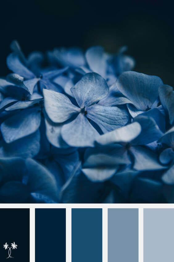
It’s no secret that a person’s preferences and interests are changing over the course of their life. As we’re getting older, we tend to develop a particular liking towards short-wave shades (blue, green, violet) while staying indifferent to long-wave hues (red, orange, yellow). The least popular colors among teenagers are violet and brown, while senior people detest yellow.

Lifehack. We recommend that you take this test by Grasshopper. Answer seven simple questions and find out what main colors are right for your brand!
How to match colors?
Now that you’ve outlined the message you want to convey to your target audience, you can get down to setting up a neat color scheme for your website, blog or landing page. Read on to find out how to do that hassle free!
Three types of colors
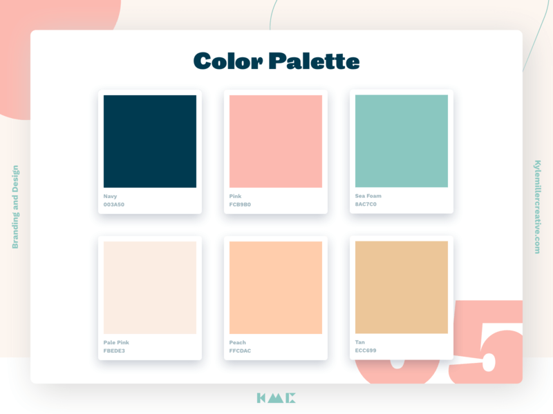
You need to distinguish three main types of colors.
Main color is a dominant shade your company will be associated with. Use this color for the key elements on your web page.
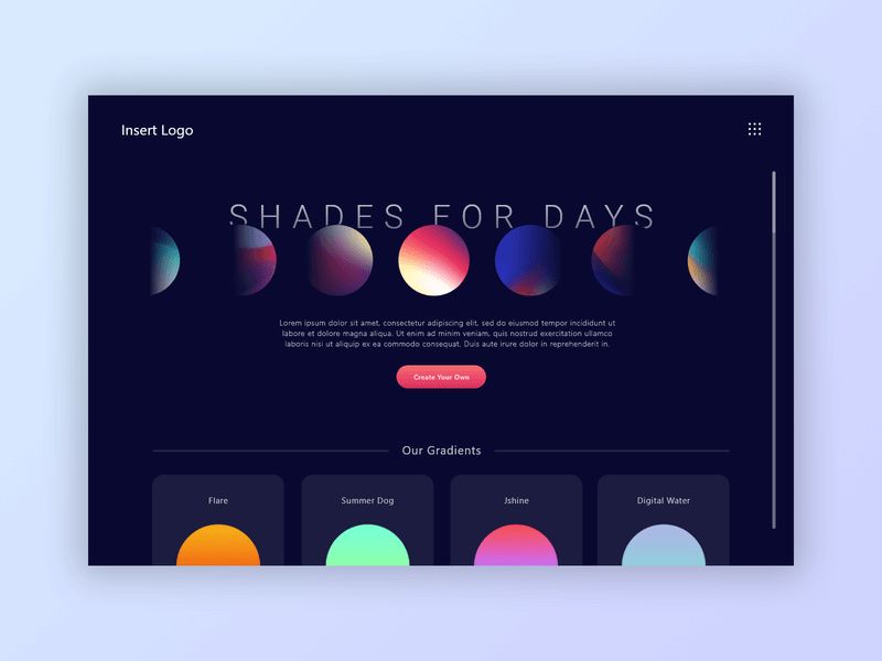
Accentuate color creates a contrast with the main color. Use it to highlights the vital elements on your website, e.g. CTA button, headlines, etc.

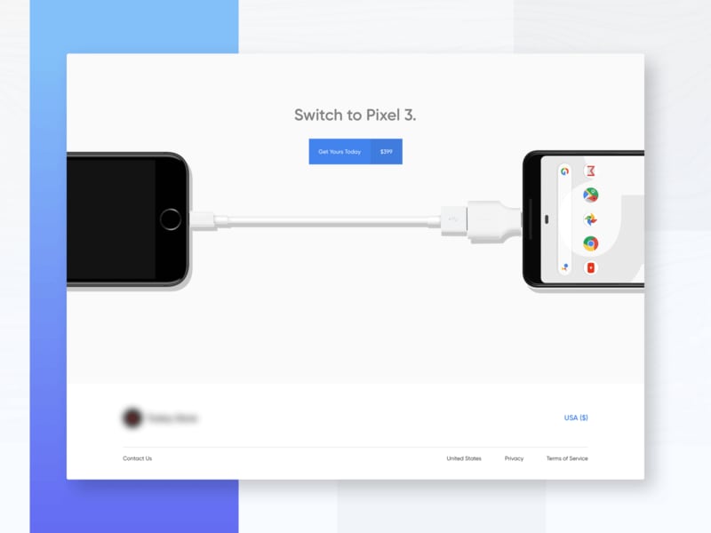
Background color shapes the background of your website. The choice of a background shade depends on your niche. For example, solid e-commerce websites (Amazon, eBay, Zara, etc.) are using a white background so as not to distract customers from the products. If, however, your brand has to do with art and creativity, feel free to exploit bold color solutions.
Use the color wheel
Color wheel is an indispensable tool for matching shades. Color combinations fall into the following categories:
- Monochrome: Different tones of the same color (from light ones to dark ones, or vice versa).
- Analogue: Adjacent colors (yellow and orange, light blue and dark blue);
- Complementary: Opposite colors (red and green, yellow and violet);
- Triad: Colors forming a triangle with two equal sides (red, yellow, and blue);
- Tetrad: Colors forming a square or rectangle (blue, green, orange, violet).
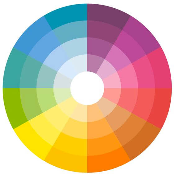
Lifehack. Check out the color wheel from Adobe Color. Enter your main color, pick the right scheme, and get a turnkey solution!.
Respect proportions
What are the optimal proportions for mixing colors? Designers have come up with the 60/30/10 rule. In a color scheme, the main, background, and accentuate colors must account for 60%, 30%, and 10%, respectively. This kind of a composition appeals to the human eye.
Logo colors
Be sure to place your corporate logo in the most visible part on your page, which is the header. Here are a few tips for painting your emblem:
- Your logo must match your background image without getting lost on it.
- Feel free to adjust contrast and brightness to find the optimal balance.
- Leave enough free space around your logo to make it easily noticeable.

Learn from the global brands and see how they’re adjusting their logos for their websites. Here are a few examples:
- While Airbnb has a red emblem, the company uses a white logo on its website to make it noticeable against the background image. At the same time, the red logo can is still used as a favicon.
- Apple is good at creating achromatic versions of its iconic logomark.
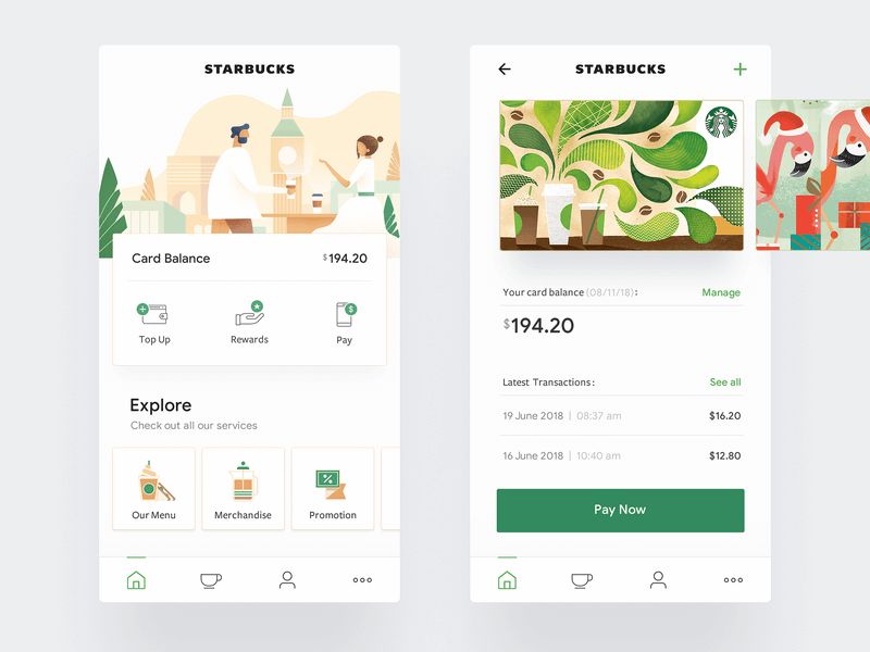
- IKEA and Starbucks never change the traditional colors of their logos. These brands tend to place their emblems against a white backdrop, with plenty of blank space around.
Lifehack. To select matching hues for your logo, use the ZenBusiness logo maker. You can generate a design in a few simple clicks and then edit it an unlimited number of times!
Choose the best color scheme
Compose 3-4 color palettes and test them. Ask your friends and subscribers for feedback. Run a survey on social media. Based on the collected opinions, choose the best option.

Conclusion
A corporate color palette can help you shape your company image, promote your brand, set yourself apart from competition, and build customer trust. Let’s sum up the highlights of this article.
- When choosing a color palette, consider the preferences of your audience, and not your own. Before making the decision, be sure to run a marketing analysis.
- With all the advanced tools and constructors out there, creating a neat website by yourself is pretty easy – even for a complete newbie!
- Stuck for ideas? See what color solutions are used by other brands in your niche. Pick the ones you like most and use them as a “guiding light” when working on your own color scheme.


