Café Logo: Guidelines and Tips
Contents
1. How to choose an icon
2. What color to pick
3. Which font is the best
4. Useful recommendations
Creating a neat café logo is the most important step in crafting your brand identity. It’s in your power to make your logo unique and memorable.
With the ZenBusiness platform and the tips below, you can create an effective café logo in a matter of minutes.
1. How to choose an icon
Choose from the items closely related to your business:
- tableware (cup, teapot, spoon, samovar);

- cooking utensils and chef’s accessories (pastry bag, spatula, chef’s hat);

- sweets and other food images (cake, cupcakes, chocolate bar, coffee).

To pick the right icon for your café logo in ZenBusiness, select the “Hotels, restaurants” category.
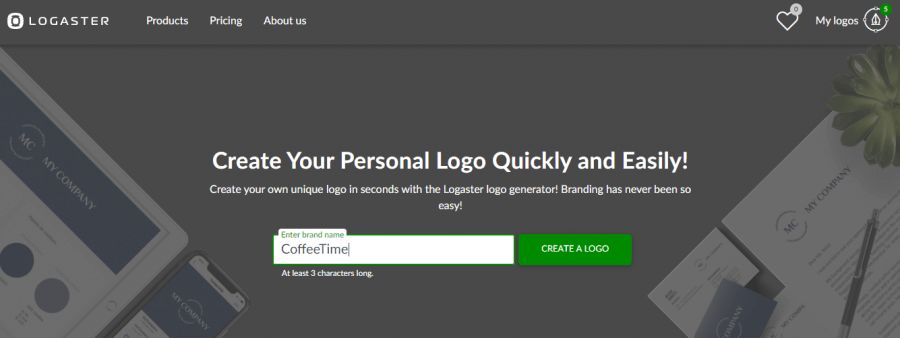
If you’ve made up your mind, use keywords to specify your search request. Both Russian and English keywords will do perfectly.

Keywords for choosing an icon: cup, teapot, spoon, knife, samovar, pastry bag, spatula, chef’s hat, apron, cake, cupcakes, chocolate bar, tea leaves, coffee beans.
2. What color to pick
Give preference to natural colors, such as beige, brown, and muted green. This is an ideal color solution for cafes, coffee houses, restaurants, and tea and coffee shops.
Another option is to apply a filter in Step 2 by clicking on “Change parameters.”
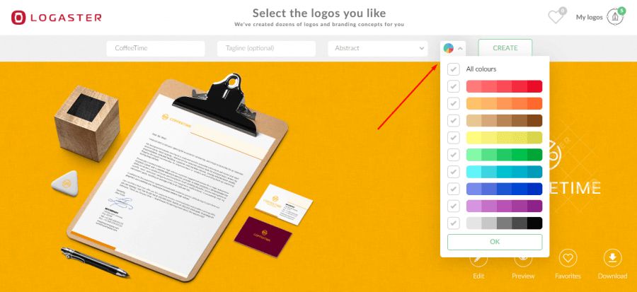
The best colors for a café logo: beige, brown, muted green.
3. Which font is the best
For detailed guidelines, read our article, “How to Choose a Font for Your Logo”. Here we will focus only on the key criteria:
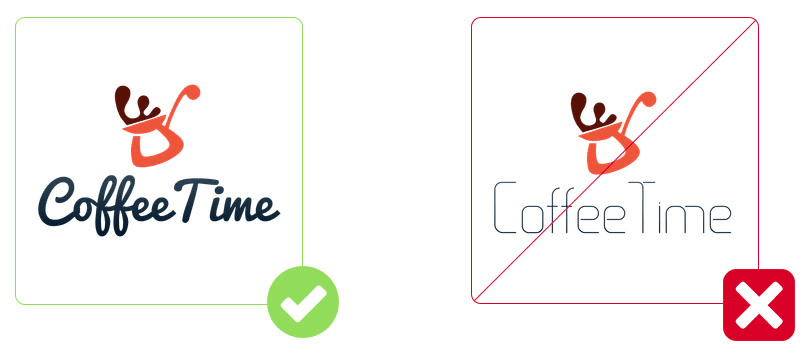
- Legibility. Your text must be easy to read across logos of different sizes;

- No minor elements. Avoid multiple scrolls and serifs in hand-written fonts, as they make text on small-size logos unreadable;

- Font-icon combination. Pair bulky fonts with massive icons.
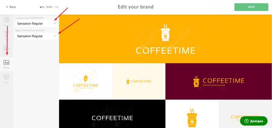
In ZenBusiness, you can pick any font for your café logo during editing.
Smart font choices for your café logo: СP Font, Cuprum, Oranienbaum, Croissant One, Andantino Script, Dita Sweet, Comfortaa.
4. Useful recommendations
Use one font, two tops. One font is your best choice. Two fonts are acceptable only if text dominates your logo.

Do not clutter your logo. A recognizable icon and a legible café name (or short motto) are the only things your logo really needs.
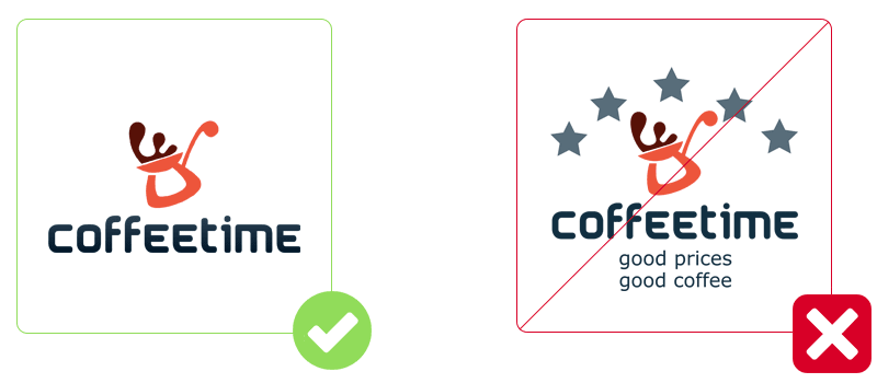
Do not overdo it with colors. Even if you’re creating a bright logo for your art café, avoid using more than 4 colors.



Leave enough free space on the edges.
Be sure to save your logo in vector format.
Making a smart café logo is not rocket science. You just need to follow some simple recommendations. In our gallery, you can have insight into our café logo collection.
Take a few minutes to create your one-of-a-kind logo now.
